Symbols that identify us 

Symbols that identify us

Metrosalud, an institution with 85 years of history and 31 years as a State Social Enterprise, has achieved a high position and valuable experience in health, providing an invaluable service to the public; but also a unique identity based on some symbols that identify us:

Our Logo

Our current logo was created in 2009 with input from our staff. It was registered as a trademark in 2012. 

It symbolizes the essence of the company; its colors are related to the municipality and the department; the three linked elements represent the union between the State, the Institution, and the Community; its name is as big and strong as the presence of the hospital network in the city. 

Our flag

Our current logo was created in 2009 with input from our staff. It was registered as a trademark in 2012. 

It symbolizes the essence of the company; its colors are related to the municipality and the department; the three linked elements represent the union between the State, the Institution, and the Community; its name is as big and strong as the presence of the hospital network in the city. 

Metrosalud Anthem

Created in 2003. The lyrics were composed by Nursing Assistant Elvia del Carmen Agudelo Cañas (currently retired).

The music was created by Víctor Agudelo, a musician from Eafit University.

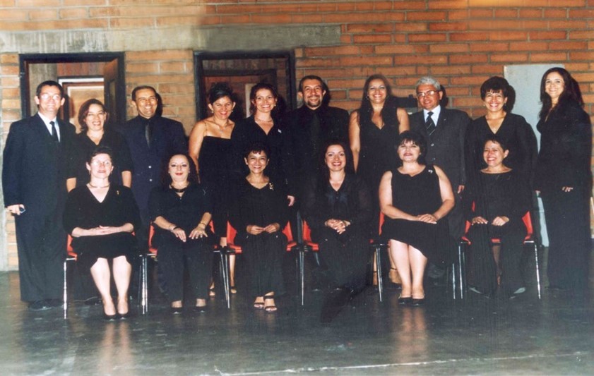
The original performance was by the Symphony Orchestra of the University of Antioquia, the ARCADIA Choir and a group of 16 employees of the ESE Metrosalud.

Scroll to Top